What makes a "good" logo?
Demystifying the logo-design process by providing an objective checklist for your new or existing logo
Branding
July 22, 2022

Introduction
Design is very subjective, and perhaps even more so is logo design. That’s one of the reasons why we love it so much, but it’s also the reason it can be so challenging. There’s certainly no shortage of articles, how-to videos, and logo design showcases out there, but we primarily see this content written for designers and ripe with subjective opinions and questionable advice (No, one of the characteristics of a good logo is not that you must be able to draw it from memory).
We wrote this article partially to demystify the logo-design process, but also to objectively articulate what makes a good logo to people who don’t do this work every day. Our clients aren’t graphic designers, they’re CEOs, marketing managers, engineers, and so on, and this content was written with them in mind. We want our clients to know the strategy and rationale behind the decisions we make while designing their logos.
In this article, we’ll get some buzzwords out of the way, talk about what the purpose of a logo is, and detail the 6 characteristics that we believe all “good” logos share.
Buzzwords
The terms “brand,” “identity,” and “logo” are often used interchangeably, but it is important to understand the differences between them. In the words of Marty Neumeier, “A brand is a result. It’s a customer’s gut feeling about a product, service, or organization. It ends up in their heads, in their hearts.” A brand is a reputation based on strategy and built over time, a culmination of touch points. A brand “identity” is a unique system of all the visual elements that identify your business and make it memorable and distinct to your customers. That includes your logo, color palette, typography, photography styles, and more. Last but not least, a “logo” is simply a graphic mark that distinguishes your business from others. Sounds simple, right?
So, what’s the purpose of a logo?
At the end of the day, your logo has one job: to identify. You need a logo so that potential customers know the difference between you and your competitors, and that’s it. To fully grasp this concept, it’s just as important to understand what the purpose of a logo is not. This is a very common misconception, but the purpose of your logo is not to represent or explain what your company does. It can, but it is not a requirement. Consider these two examples:
First, think about Nike. The Nike logo is not a shoe, it’s an abstract wing representing the Greek goddess of victory. Their logo is a symbol of the confidence they instill in their customers, and it aligns with their mission statement: “Everyone is an athlete.”
Now think about Target. The Target logo is not a storefront. In stark contrast to Nike, the logo is a target just because the brand’s name is Target. There’s no hidden meaning, it’s not necessarily representative of anything, it’s purely a brand recognition play.
Paul Rand, perhaps the world’s most recognized logo designer, said “A logo derives meaning from the quality of the thing it symbolizes, not the other way around.” In other words, the best logo on the planet cannot fix a bad business. Overall, your logo only needs to identify your business in a clear and memorable way. To do that, your logo needs these 6 characteristics:
- Simple
- Sound form
- Versatile
- Unique
- Appropriate
- Timeless
1. Simple
Simple logos are quickly recognized and easily remembered, which is important in a world where attention spans are getting shorter and shorter. Remember, your logo does not need to explain what your business does, it just needs to identify it. How simple your logo is will determine whether or not it accomplishes characteristics 2 through 6.
2. Sound Form
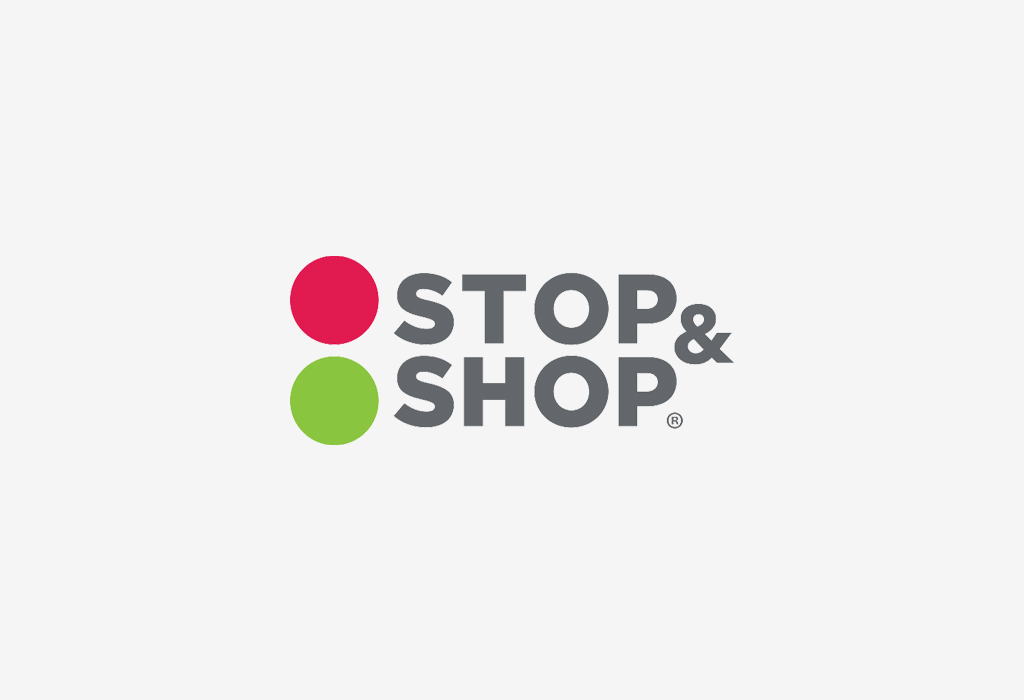
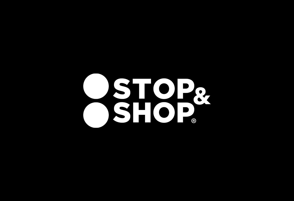
The human brain perceives shapes before it perceives colors, so it’s important for your logo to not rely on color to communicate an idea. At Zone, we start every logo design project in black and white for that very reason, to make sure that the shape and form of our logos are sound. If you look at Stop & Shop’s logo in a 1-color application, you can see it’s not as effective as the full-color version. The logo relies on color to communicate that the symbol is a traffic light.
3. Versatile
Good logos are designed to work effectively on everything from a 50-foot billboard to a 16-pixel wide digital favicon, and they can’t unless they are simple with sound form. Logos that aren’t simple are often illegible in small digital applications, and even in some printed applications. In addition to their scalability, good logos are also versatile in terms of color. As mentioned above, does the logo work in black and white, full color, reverse color (i.e.: a white logo on top of a dark background or photo), etc.?
Caterpillar’s logo is simple in it’s use of a san serif typeface and a singular geometric shape, it does not rely on color to communicate an idea, it’s versatile in it’s usage of color, and it’s even versatile in that their brand identity supports an abbreviated logo for smaller applications.
4. Unique
Perhaps the most difficult characteristic to accomplish is uniqueness. When we design logos, we first identify industry cliches and themes, and generally avoid them. For example, Google “construction logo” and you’ll see a flood of hammers, wrenches, and abstract building shapes. If the purpose of a logo is to distinguish your business from others, it must be unique.
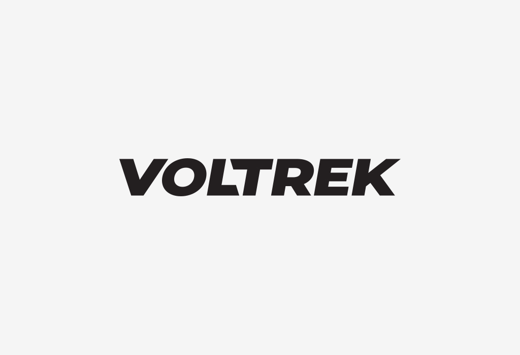
We always strive to design logos that feature something unexpected and memorable. Below is an example of an early logo concept for a client in the EV space. The negative space between the “L” and the “T” forms the shape of a simple bolt.
5. Appropriate
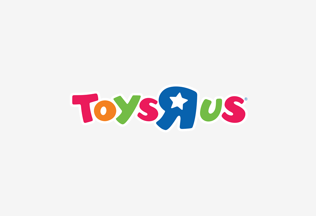
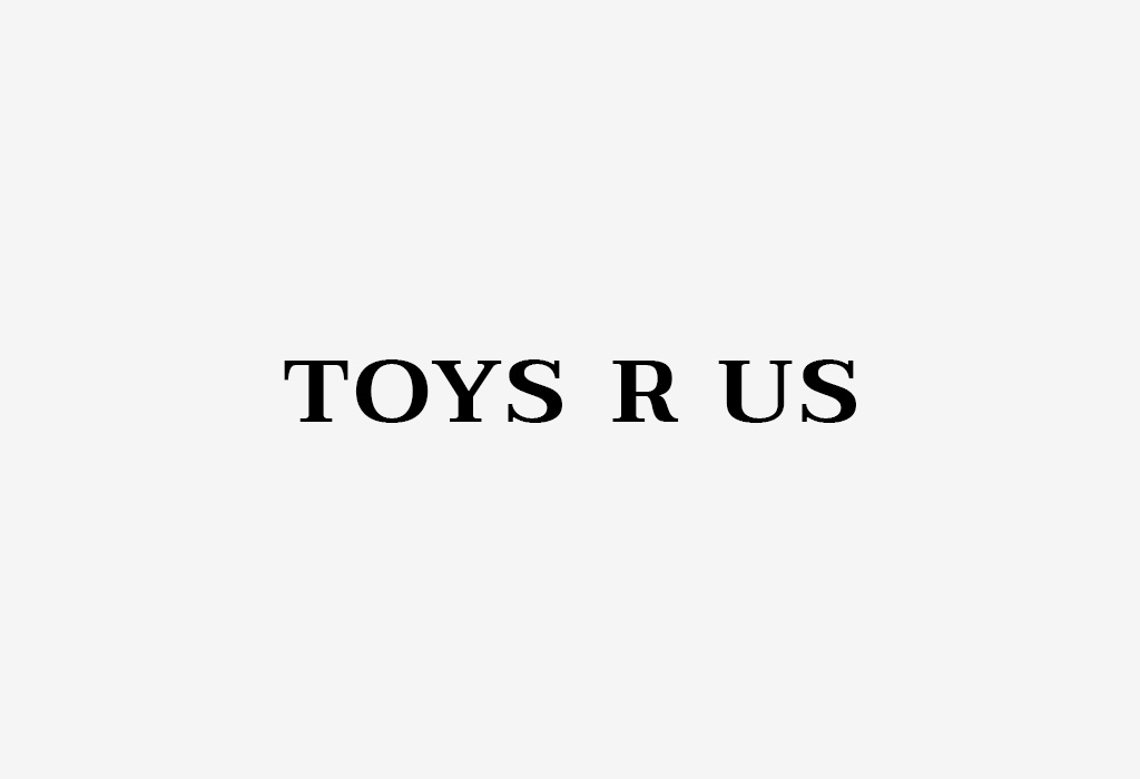
While avoiding industry cliches and themes, your logo still needs to be appropriate for the space your business is in. Consider the Toys R’ Us logo below as an example. The playful, bubbly letters are appropriate for a business that sells toys. Their logo would not be effective if it had been designed using a formal serif typeface.
6. Timeless
While we actively avoid industry trends while designing logos, we also avoid graphic design trends. Graphic design trends come and go year after year, and logos, by definition, are the opposite of trendy. If we do our jobs right, you should never have to redesign your logo ever again.
Need help with a logo project?
If you couldn’t tell by now, we love designing logos and obsessing over every detail along the way.


